Jota
Client
Praisce Capital
Timeline
Mar 2022 - Jun 2024
Role
Product Designer
Outcome
Currently, a significant portion of advisors have seamlessly transitioned to the redesigned platform. We anticipate residual migration as we phase out the previous system.
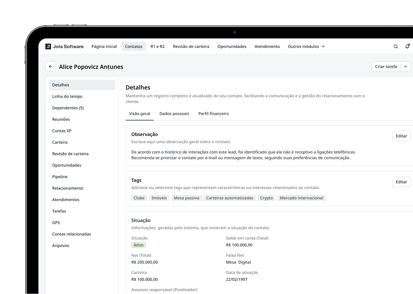
Project Overview
The Jota project began as a redesing of Praisce Capital's previous CRM, evolving into a more comprehensive project with ambitions to transition to a white label product. This initiative was based on identifying usability issues and discerning essential features for subsequent product iterations.
My Role
As the sole designer on this project, I was responsible for the entire design process, from initial discovery to the current version. I helped our Product Manager write requirements, conducting discovery and usability research. I also worked closely with the engineering team to develop viable solutions to problems encountered
Business Objectives
- Enable Praisce Capital administrators to seamlessly onboard users onto the redesing Jota platform.
- Achieve complete contact migration to the updated experience within the upcoming years, subsequently decommissioning the predecessor system.
Goal
- Enhance advisor efficiency and agility.
- Amplify clarity in team tracking and objective management.
- Foster a user-centric, intuitive interface.
- Cultivate more potent and resilient user pathways.
Challenges
- Overcoming user reservations stemming from the prior interface.
- Refining and streamlining managerial workflows pre-project commencement.
- Addressing inconsistent user profile treatments across diverse workspaces.
- Accommodating intricate administrative rules.
- Navigating tight schedules amidst high-demand deliverables.
- Operating with a compact team size.
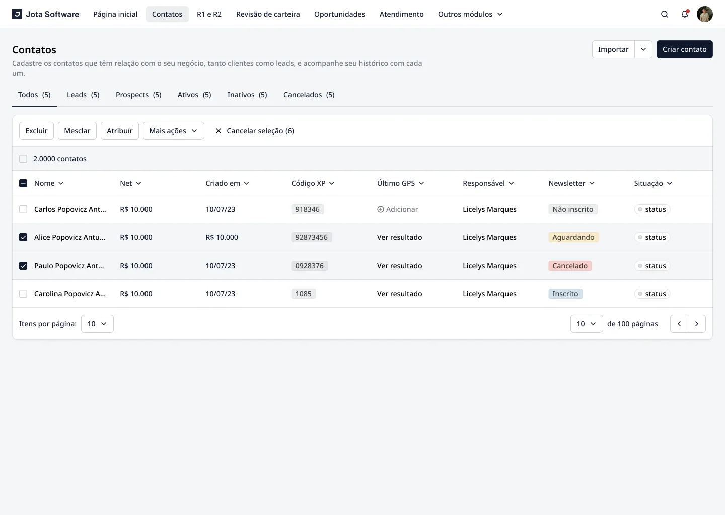
Usability Testing, Findings & Iterations
I conducted usability tests with our main users to validate our new designs. We created a scenario for users to start and move a lead through the system.
During the sessions, we noticed some issues. Users found creating leads easy, but moving them through the system was difficult. After analyzing the results, we discovered that bugs and unclear navigation made the process challenging for users.
Findings
Key insights gleaned from our research:
- Ambiguity surrounding the "All" column misled advisors into misconstruing its role within the lead capture process.
- Navigational inconsistencies compelled advisors to manually scour each column to monitor contact status.
- The transition mechanism between columns lacked clarity, evidenced by user queries.
“How do I transition the lead from the 'All' column to 'Prospect'?”
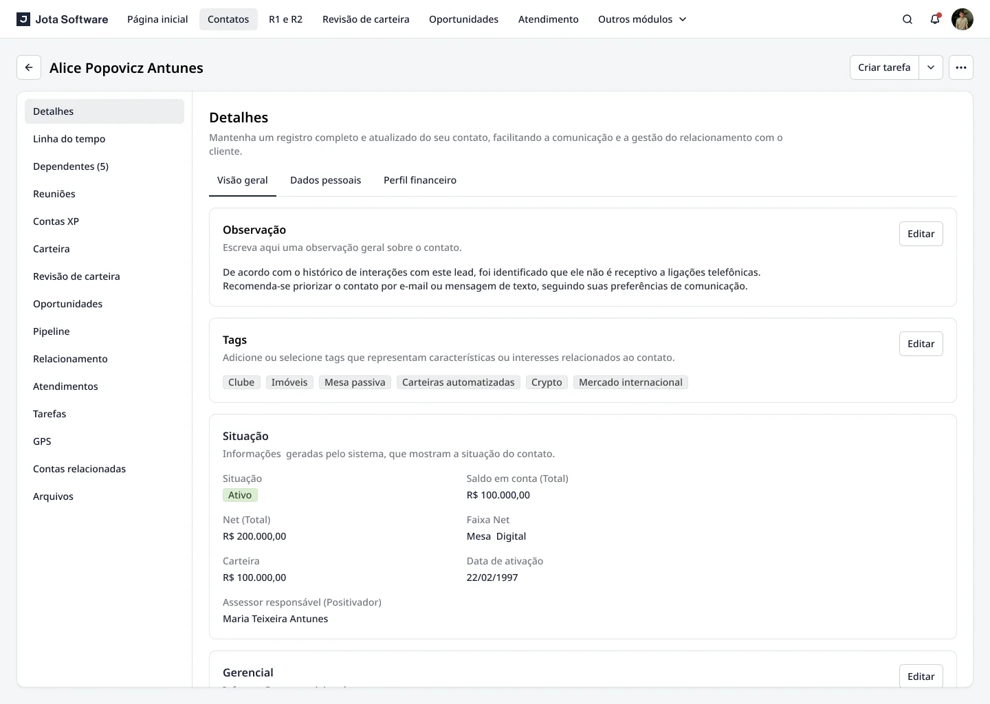
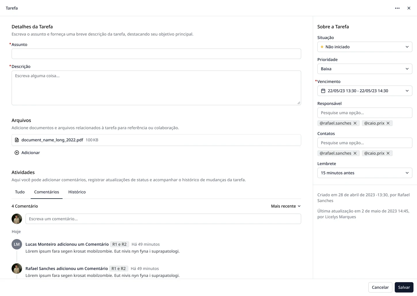
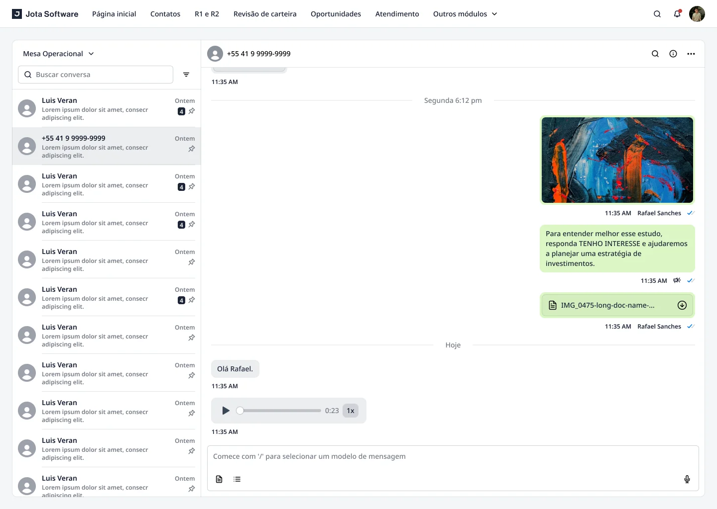
UI Design & Prototype
The culmination of the design journey resulted in an interface that seamlessly integrates advanced financial tools with user-friendly design elements. With a focus on customization and clarity, Portal promises a transformative financial management experience.